Make room
for the creative work.
Brandreforge helps designers speed up the branding process inside Illustrator, so more attention can go into the creative decisions that matter.

Pages from the Brandreforge identity guide v2.0. The supplied artwork and the specifications below are the implementation source of truth.
One source. A coherent brand.
- Purpose
- Reduce repetitive production work.
- Audience
- Independent designers and branding studios.
- Promise
- A clearer path from artwork to brand system.
Creative control. Less repetition. Our voice is precise, helpful and assured.
A system, taking shape.
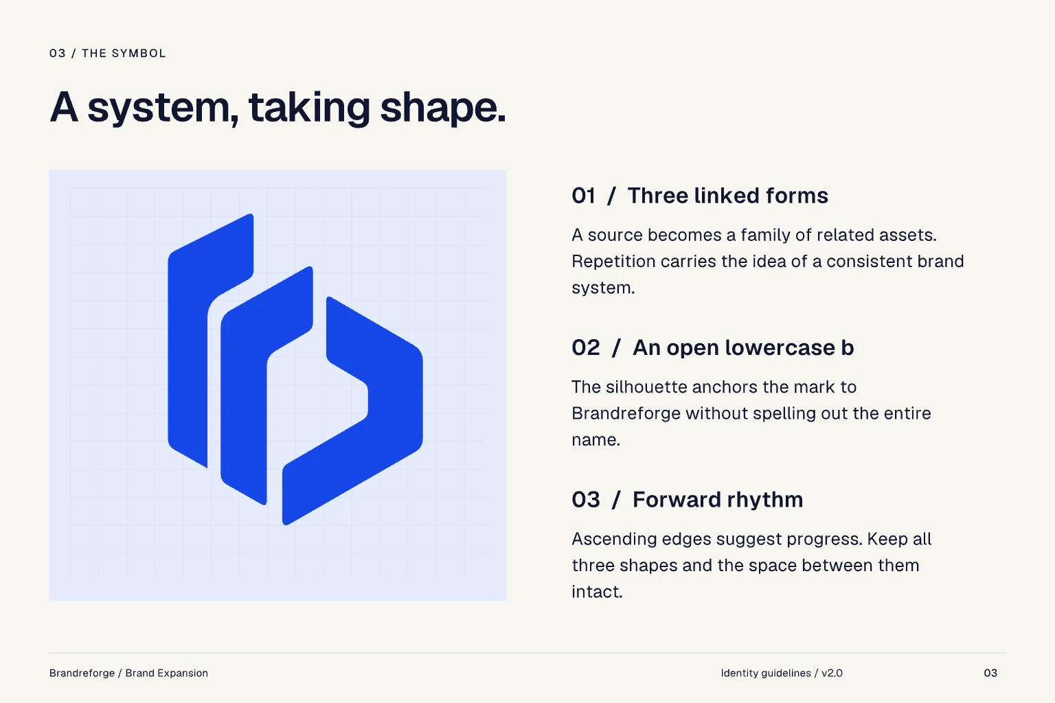
Three linked forms: a source becomes a family of related assets, and the repetition carries the idea of a consistent brand system. Their silhouette is an open lowercase b, so the mark points to Brandreforge without spelling out the name. Ascending edges suggest progress. Keep all three shapes and the space between them intact.
Use the right signature.
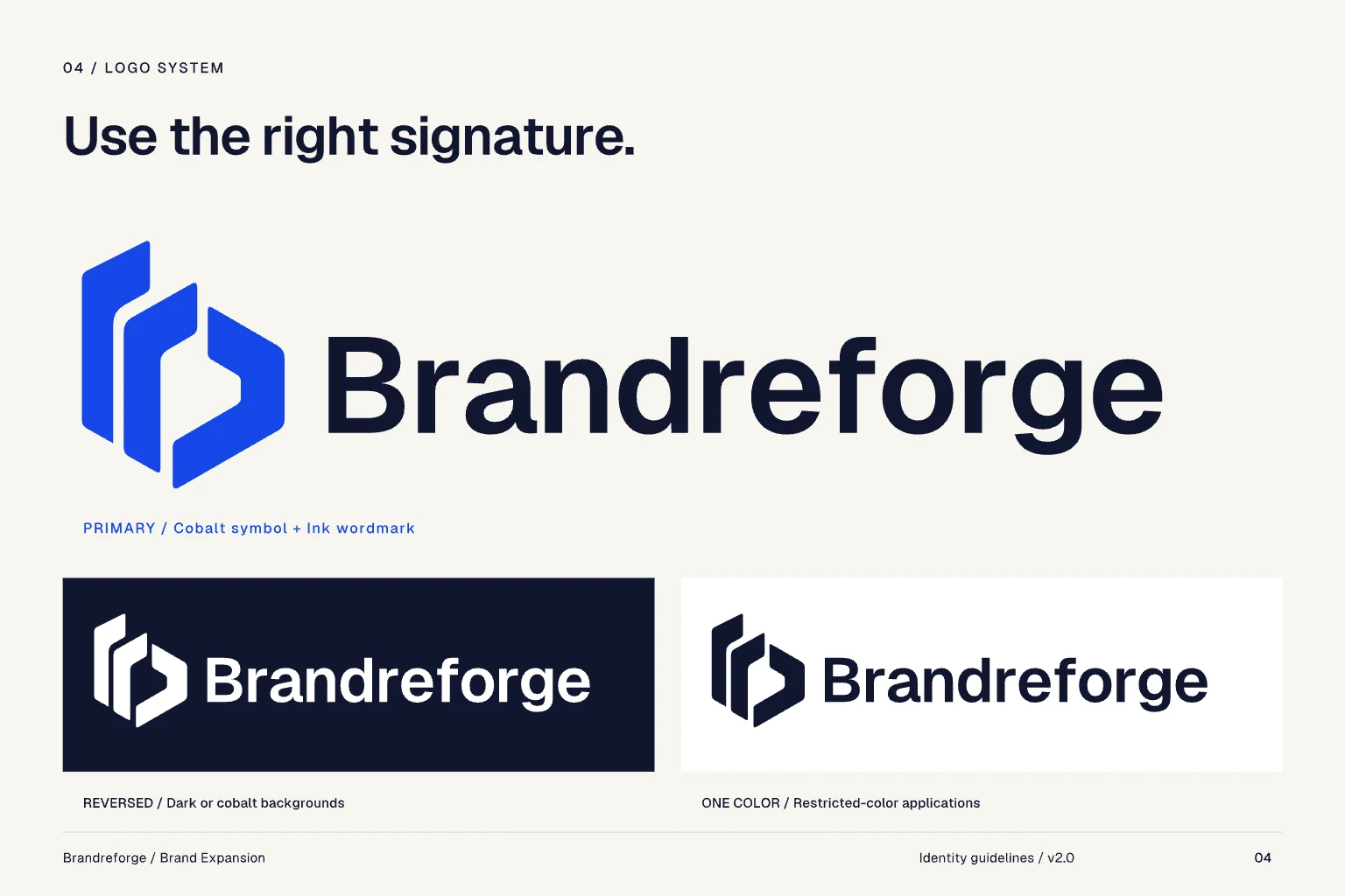
Primary: the cobalt symbol with the ink wordmark. Reversed, all white, on dark or cobalt backgrounds; one colour for restricted-colour applications. The wordmark is outlined artwork: use the supplied files and never type the name in its place.
Keep clear space of one quarter of the symbol height on every side. Full signature: at least 160 px wide on screen, 35 mm in print. Symbol alone: at least 24 px or 6 mm high. Below 24 px use the micro-mark, and never shrink the full signature into a favicon.
Cobalt leads. Space supports.
Default to generous Paper surfaces, Ink text and focused Cobalt accents. Mist gives supporting areas a quiet surface. Text pairings: Ink on Paper 16.49:1, white on Cobalt 6.77:1, Cobalt on Paper 6.26:1.
These are RGB masters. For print, convert them with the printer’s ICC profile and approve a physical proof.
Clear, capable, quietly distinctive.
Geist · Regular / Medium
Body copy, labels and controls.
Geist · Semibold
Display and headings.
- Display
- 48–80 px · Semibold
- Heading
- 24–40 px · Semibold
- Body
- 16–18 px · Regular
- Controls
- 14–16 px · Medium
One versatile family keeps the product and the brand connected: use weight and scale for hierarchy. Body line height 1.5, headings 1.1–1.2. Avoid all-capital paragraphs.
Sound like a designer’s ally.
Lead with the task, show the next step and explain the result. Be specific about what the app does. Speed is the benefit; creative control stays with the designer.
- Positioning
- The branding workflow companion for Illustrator.
- Short promise
- Less repetition. More room to create.
- Primary action
- Build your brand system
- Progress message
- Preparing your brand assets…
- Helpful error
- Choose a logo before generating the layout.
Avoid unsupported time-saving numbers, guaranteed results and any language that implies Adobe endorsement.
A calm home for creative work.
Use the reversed signature in dark product chrome. Keep Cobalt for primary actions and selected states, with readable labels and visible keyboard focus. Build on an 8-pixel spacing unit, with 5-pixel control corners and 12-pixel panels.
Consistency is the advantage.
- Keep the proportions
- Never stretch or skew the mark or wordmark.
- Keep the three forms
- Do not merge pieces, close gaps or add shapes.
- Keep the approved colours
- Avoid gradients, shadows, glows and mixed-colour pieces.
- Keep it readable
- Use the supplied light or dark version for contrast.
- Keep the signature intact
- Do not retype, rearrange or change the logo spacing.
- Keep the name consistent
- Write Brandreforge: capital B, the remaining letters lowercase.